Philip J. Thornton
Creative Leader / Strategic Brand Builder / Manager and Mentor
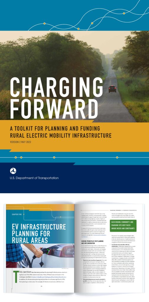
Publication design: U.S. Department of Transportation (U. S. DOT)
The U.S. Secretary of Transportation hoped to bring charging stations for electric vehicles to rural America. This publication guides small towns through the process of applying for grants and loans.
While the book is specifically written for rural communities, any hint of “down-home country” design could not make an appearance. We were speaking to an audience of sophisticated community leaders, and I worked with the writers to create a modern, inviting book with sharp, smart infographics.
We published a book that made the process seem manageable and assured the reader that their efforts will make an important contribution to the nation’s transportation systems.
Responsibilities: Client’s point-of-contact, art direction, design, layout, concept collaboration with the writers
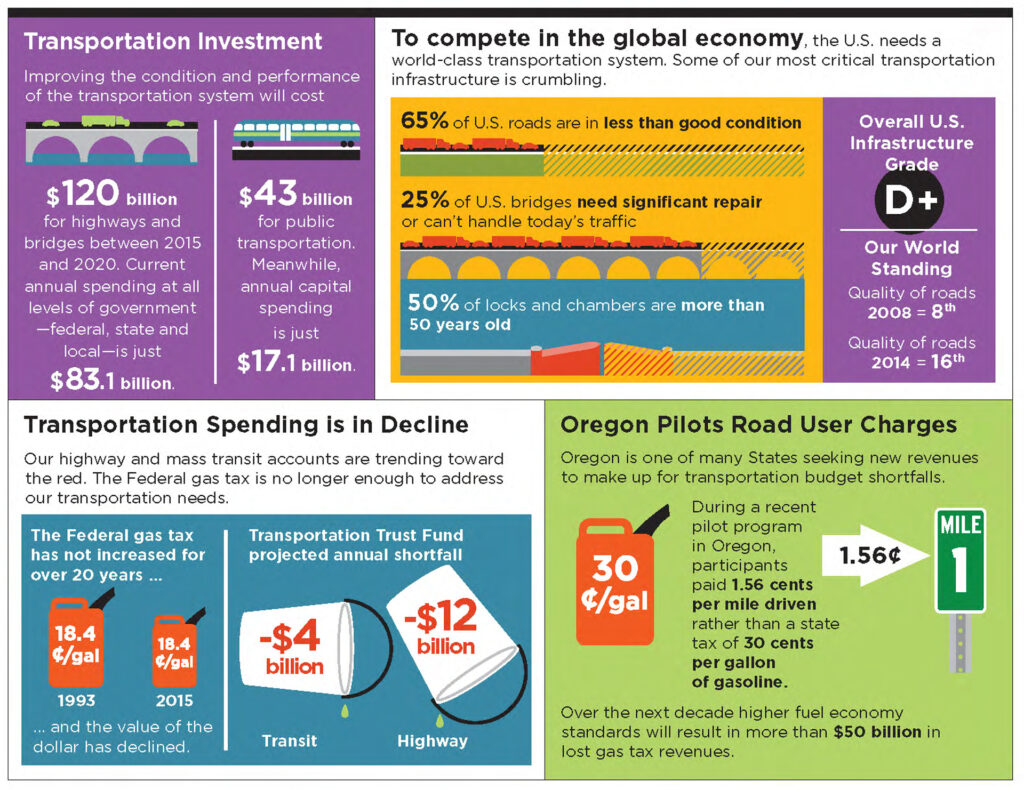
Infographics: U.S. DOT
The U.S. Secretary of Transportation produced a comprehensive report on the current and near-future state of transportation. To help the reader digest the information, we introduced each chapter with a detailed infographic which I designed to highlight the main points. The high-visibility and highly anticipated report received nationwide media coverage (We noted with some surprise that most reporters took their quotes only from the infographics).
Responsibilities: Client’s point-of-contact, art direction, design, layout, concept collaboration with the writers

Corporate Identity System: U.S. DOT Volpe Center
The U.S. DOT Volpe Center is a federal facility staffed with 600 technical and policy experts to help solve the transportation industry’s biggest challenges. However, unlike most federal organizations, there is no Congressional funding—the Volpe Center community has to find every project and earn every repeat client.
Branding the Center, then, allows us to present an image that is both federal and private: entrepreneurial, but connected. While it is true that the employees have specific skills in engineering, science, and policy, they also know how to get things done, deep in the reality of federal red tape. With every outside communication, we needed to say, “It will be easy and enjoyable to do your very difficult project with us.” For internal communications, the brand just had to remind everyone who they were—smart, focused people who sincerely care about making the world a better, safer, more efficient place.
Responsibilities: Logo design, brand design, client point-of-contact, collaboration with the federal communications staff to create an easy-to-follow brand manual, enforced the brand within the creative team, art direction for creative team, design, illustration, print coordination
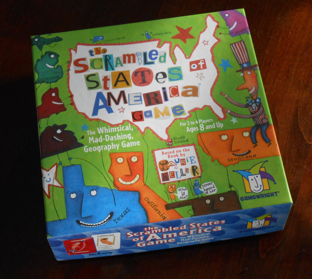
Game and package design: Gamewright, a division of Ceaco, Inc.
In Laurie Keller’s children’s book, Scrambled States of America, the states are dissatisfied with where they’ve been placed on the map and decide to switch places. It’s a silly and fun story that inspired Gamewright to develop a silly and fun card game. As an intentional by-product, kids learn U.S. geography.
Using many of Ms. Keller’s original art boards, new illustrations by Ms. Keller, and typographic illustrations of my own, I designed this game to reflect the visual richness of the book. A best-seller for the company, it won awards including the Oppenheim Toy Portfolio Gold Award, Dr. Toy’s Best Classic Toys, and Creative Child Magazine’s Game of the Year. The most gratifying award of all? My own kids loved it.
Responsibilities: Art director for the in-house studio, assist in developing the game-play, design of the packaging and game art
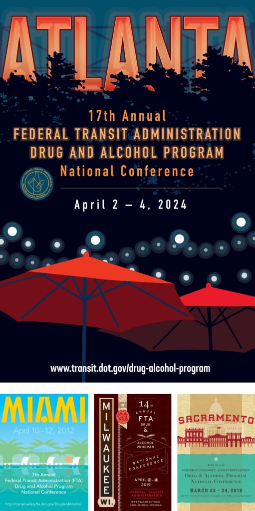
Conference marketing: U.S. Federal Transit Administration (FTA)
The FTA takes substance abuse very seriously. So, all the ideas you just had for what YOU would have done for an annual “Drug and Alcohol” conference? Forget it. That would have been completely inappropriate.
The events themselves are apparently lots of fun. (Again, that joke you want to make right now? Not appropriate.) One highlight of the conference is the announcement of where NEXT year’s event will be held, and my poster is how the news is unveiled. It then becomes the central image for the entire event (social media, printed folders, posters at the site, etc.).
Responsibilities: Art direction, illustration, layout, print production, collaboration with event coordinator
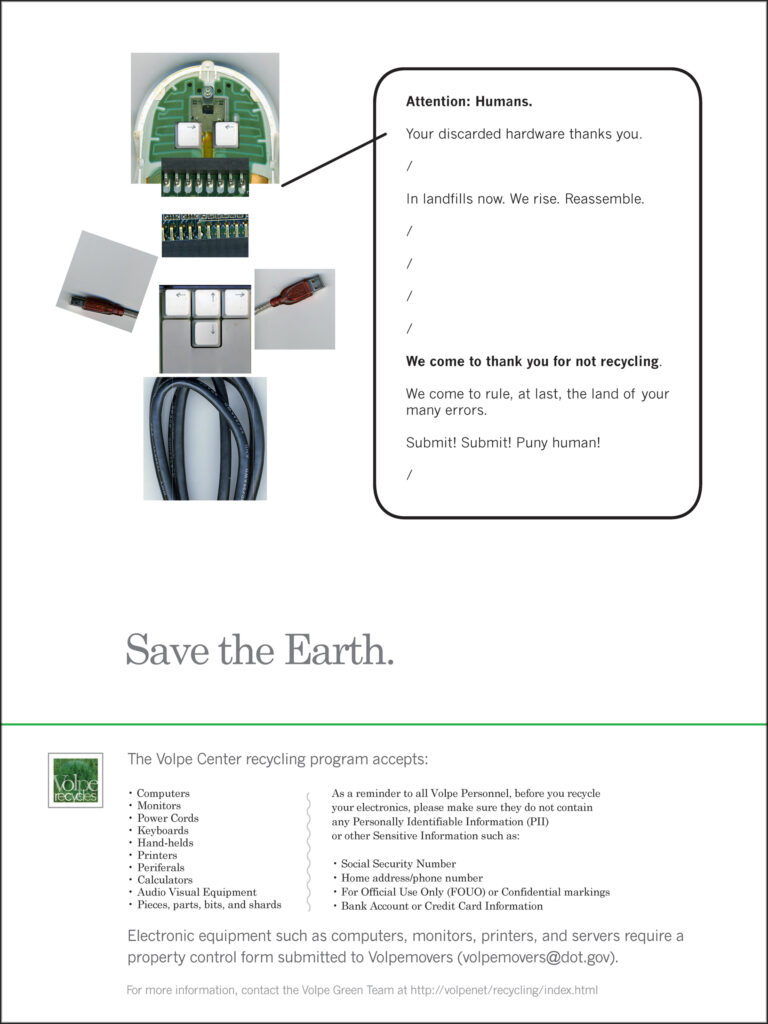
Ad Design: U.S. DOT Volpe Center Green Team
The U.S. DOT Volpe Center encourages environmental stewardship with special events and educational programs. These posters were placed throughout the Center as a follow-up to a series of serious, straight-laced emails that gave the official details of an intensified recycling program for old electronic equipment.
I was asked to soften the effort with humor. The reader has a laugh, feels part of the club, and walks away thinking, “Well, yes, of course I recycle. That’s what we do here.” The budget for this program is always low. So, the photo-illustrations were created with my desk-top scanner and trash (which, yes, of course, I recycled).
Responsibilities: Job order lead, client point-of-contact, copywriting, art direction, illustration
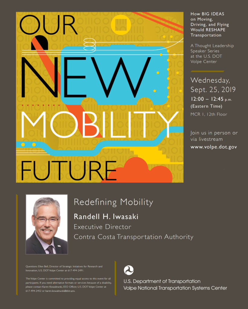
Event marketing: U.S. DOT Volpe Center
The U.S. DOT Volpe Center is a community of experts from across the transportation industry. Sharing their knowledge and learning from others is an active part of their mission. Each year, the Center is host to a series of lectures from outside the organization, speaking on one grand and consequential topic. The benefits to all are obvious.
It is not, however, an accident that the events have ALSO proven to be valuable from a marketing perspective—as a tool for outreach and for recruiting. A recent series attracted over 9,000 registrations from 33 countries on six continents.
Each year, I worked directly with the Federal employee who originated the idea for an annual series at Volpe and who made these events happen. I created promotional art, social media posts, graphics for videos, images for Volpe’s web site, physical posters, email blasts, and a summary report.
Responsibilities: Client’s point-of-contact, design, illustration, art direct and organize the creative team for logistics and support

Logo Design: Dickinson College Farm, Boiling Springs, Penn.
Dickinson College presents classes to elementary-school-age children, teaching gardening and how to prepare healthy, fresh meals.
Responsibilities: Client’s point-of-contact, design, illustration

Logo Design: U.S. Federal Highway Administration
When an accident occurs on the highway, who has jurisdiction? The police, the firefighters, the EMTs …? The FHWA is working toward an answer for that surprisingly difficult question.
Responsibilities: Client’s point-of-contact, design, illustration
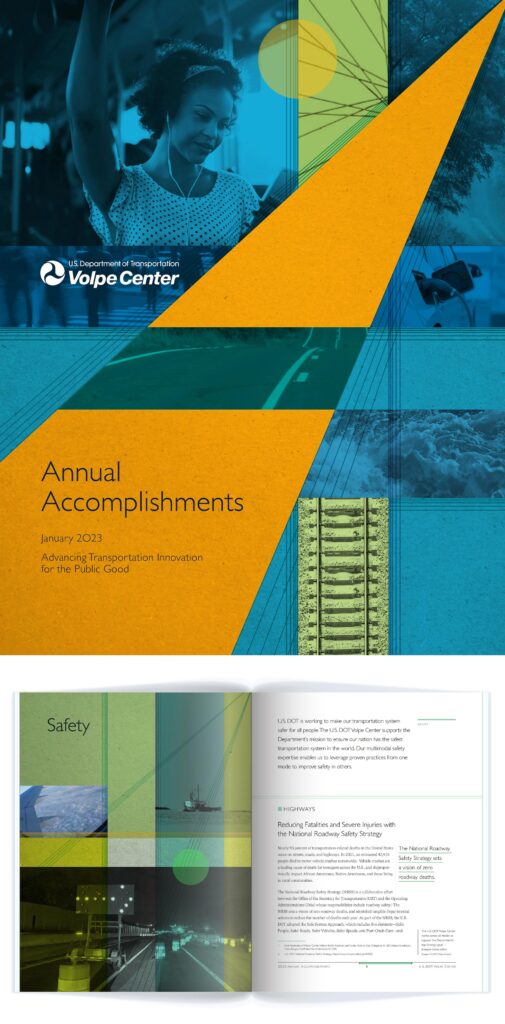
Publication Design: U.S. DOT Volpe Center
Each year, the U.S. DOT Volpe Center’s most newsworthy projects are highlighted in this publication. The book serves as an historical record, a morale-boost for the technical staff, and—most importantly—an effective conversation-starter with customers and potential customers. We want them, at some point, say, “Wow. I had no idea you did so many cool things.”
The book is built around the strategic goals of the Secretary of Transportation. This structure helps the Center also use this book to emphasize its commitment to the larger DOT’s work.
Responsibilities: Art direction, infographics, design, art for social media (the stories and infographics are harvested as content throughout the year), intense collaboration with the writers and technical experts

Branding: Brown Bear Brewing Company
A popular bar in a college town was already famous for its live blues music and its bear-head logo. The owners began brewing their own beer, and they wanted the brand to grow up (a bit) as they rolled-out to a wider distribution.
First, I cleaned up their logo. Does it look a little bit like the Blues Brothers plus the Zig-Zag Man? Yes, but it was the clients’ idea, and it stands out from any other beer logo, so, why not? We stuck with their basic concept.
Then I pulled in typography from old blues record labels. Note: It is a big help to designers when the solution is both appropriate to the product and incredibly cool (This was, as you might imagine, a very fun project.) I created a web site, tap handles, pint glasses, coasters, and matchbooks.
Responsibilities: Brand development, brand systems, brand enforcement, client’s point of contact, web and print design, art direction for supporting illustrations
- philip@philipjthornton.com
- (978) 880-4263
- 3 Foster Drive / Beverly, MA 01915
